Web Design 10 Commandments
Web Designers are as diverse as websites. However, the purpose of this article is to attempt to nail down what consistently breeds success. While I use the term ‘commandments,’ I recommend looking at the following more as guidelines:
[emaillocker id=”12337″]
I appreciate you sharing your contact information with me. This post has been used for the content of my ebook. Feel free to download my eBook with the button below.
[themify_button size=”xlarge” link=”https://bit.ly/2JAMPnQ”]Download eBook[/themify_button]
1st Web Design Commandment:
Thou Shalt Design for Mobile
Google is set to prioritize mobile websites over desktop in their search results listing. While this is not an SEO article, it is important to highlight this incredible trend. For the web developer and anyone interested in the design, this means that the mobile device experience is more important than ever.
Learn more about The AMP Project (https://www.ampproject.org/), which aims to make mobile pages faster.
The following is an article about Google’s mobile-first indexing:
https://www.forbes.com/sites/jaysondemers/2017/01/26/what-googles-mobile-first-index-means-for-your-seo-strategy/
2nd Web Design Commandment:
Thou Shalt Make All Text Legible
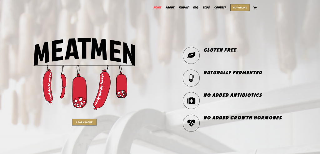
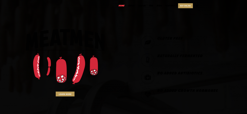
Be thoughtful and careful when overlaying text in front of photos. Text that is not readable is not only impractical in a technical sense, but an unfashionable choice. If you insist on using photos or renders with a text overlay, darken or lighten the photo/render so that text is legible.


Another potential danger with text overlay on photos is the exclusion of access for color-blind users. While it is unavoidable that people will have a different experience due to vision impairment, as designers we should strive to make the information on our sites as accessible as possible for those with disabilities. The purpose of design is communication.


3rd Web Design Commandment:
Thou Shalt SVG
Scalable vector graphics (SVG) have taken the internet by storm. Nearly 98% of browser users can see SVG (http://caniuse.com/#feat=svg). With the functionality of SVG, the short-lived portable network graphic (PNG) will be left in the dust. SVGs work great for logos or any vector-based art.
Stay tuned for more information on SVG and vectors. I will write another article shortly. For now, check out this slideshow from a recent presentation about image formats:
https://www.icloud.com/keynote/0tnyaZTAAakh-np0sJAifIe4A#Presentation
4th Web Design Commandment:
Thou Shalt Use Flexbox or Grid, Not Float
Floating elements in CSS to create columns and rows is obsolete. Use Flexbox for one-off (HTML/CSS) operations, and Grid for larger projects (XML/SASS). Flexbox works for 95% of users. On the other hand, grid has a much higher incompatibility rate. Though the grid still functions in a usable way even if it is not “compatible” with some of the older browsers that are still in use.
What is Flexbox? Flexbox is an element display hierarchy for responsive design. What is grid? A grid is a column and margin based hierarchy for responsive design. Stay tuned for another article on flexbox and grid coming soon. The following slides are from a past conference presentation about Flexbox:
https://www.icloud.com/keynote/01rl90rLIsc6hqK7SvhUxiIXg#flexbox
This is a post I recommend about grid:
https://alistapart.com/article/the-new-css-layout-excerpt
5th Web Design Commandment:
Thou Shalt Study Typography
Typography is the art of arranging font in a way that ‘works.’ Honestly, Typography should be called Type Theory (like music theory). My suggestions to new designers are to pick from a smaller pool of fonts. Helvetica is awesome! When in doubt, use Helvetica. No font is more versatile and timeless. Also, when in doubt, align left! Always try to build on an axis. If you are using different font weights, always skip a weight. For headings, double your font size. If you place words together it conveys that words are connected. So be mindful of text placement. I also recommend avoiding the corners of the screen, giving yourself healthy margins in all your designs. Never use forced justified type.
Here is a list of great potential fonts to choose from: Akzidenz Grotesque, Avenir, Avant Garde, Bell Gothic, Bodoni, Bembo, Caslon, Clarendon, Courier, Din Mittelschrift, Franklin Gothic, Frutiger, Futura, Garamond, Gill Sans, Gotham, Helvetica, Letter Gothic, Memphis, Meta, OCRB, Rockwell, Sabon, Trade Gothic, Trajan, and Univers.
6th Web Design Commandment:
Thou Shalt Think Process, Process, Process
Know your process so you can reproduce it. Clients will be more confident employing your services if they see a clear path to achieve their objectives. Use case studies to ensure the client that you can predictably achieve the desired results. When a designer is less of a risk they make more room to charge more for their services. Prepare templates ready to go for every step of the process, from pitch to hand-off. I would love to share some of my templates with you. Sign up for the email list and shoot me an email to let me know what type of template you would like.
7th Web Design Commandment:
Thou Shalt Keep Up With Design Trends
Make friends and use them for their feedback!
The current year is 2018, and what was once fashionable in web design may be the next red carpet blunder tomorrow. For instance, take drop shadows. I want to be careful when counseling that drop shadows work great in some contexts. I recently spoke to a woman who was creating a site for a flower arrangement competition. The site was covered with drop shadows. Drop shadows convey the project has depth, but they also make the project seem heavier. On a smaller screen, a drop shadow can seem noisy because it is difficult to quickly visually process a drop shadow.
8th Web Design Commandment:
Thou Shalt Use a Color Palette
Consider using a distinct and consistent color palette across all mediums. I recommend using fewer colors rather than more. Colorful design is great, but if you are relatively new to web design, there is a good possibility you could harm yourself more than help. Like with font choices, minimalism is more achievable for a beginner.
Free color palettes from Adobe:
https://color.adobe.com/create/color-wheel/
9th Web Design Commandment:
Thou Shalt Spend Time in a Discovery Phase
The words “design” and “art” are not synonymous. Art is an expression. While design can be subjectively expressive, the goal of the design discipline is to communicate. Therefore a dialogue between the designer and the business representative is essential. Your job as a designer is to help organizations realize their brand in the form of a website. The brand exists before you had ever met the client, and your role is merely to uncover and establish. Usually, for me, I have multiple discovery sessions. It can take upwards of a third the scope of the project with a new client.
https://www.youtube.com/watch?v=lGmPCutgI2o
The above video addresses stylescapes, which I recommend for all web designers.
10th Web Design Commandment:
Thou Shalt Plan with the Objective of the Site In Mind
This is connected to discovery. First off, you need to take a good hard look at the business you are prospectively working with. If they are looking to sell online, you design the site so that the user is driven towards that goal. If you would like to do email capture, then create a site that will capture emails. The possible objective of a website has no limit. Know that objective upfront and stay focused on it. Some businesses need vast libraries of information and hundreds of pages for their site. Other businesses would only need a single page site, allowing the business to free up resources for other business demands.
Wrapping It Up
So did you agree with my guidelines? What did you like? Did I miss something? Let me know below!
[/emaillocker]


October 30, 2017 @ 5:35 pm
awesome post, and great tips! thanks!
October 31, 2017 @ 4:36 am
You are welcome! Glad you liked it. Thank you for the comment!
October 31, 2017 @ 6:52 am
Great article, can’t agree more with it! Will share it right now 🙂
October 31, 2017 @ 7:03 am
Wow. I am so overwhelmed with the reception for this article. Thank you so much!
November 2, 2017 @ 2:08 pm
Thanks for the new info, refresher info on other points, all in all a great base from which to build your next website on… I’m moving everything VECTOR to .svg on our site… stay tuned and thanks for the nudge in the right direction!
November 6, 2017 @ 3:54 am
Thank you, Phil. Let me know if you have any questions along the way. Have we met?
November 7, 2017 @ 4:51 am
Hey very interesting blog!