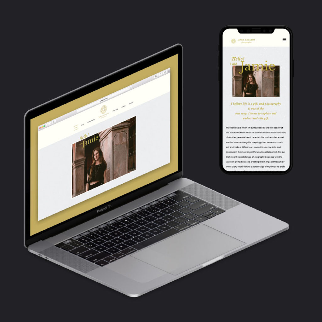
Thoughts from Jamie:
When I first started the process of working toward a new website for my business, I knew I wanted a hand in the design and would need to find a web developer to partner with in order to give life to that design. I was tired of seeing the same templates recycled in the wedding photography industry. I also wanted to add some personal touches, especially since there were a few aspects of my business that I wanted to highlight: namely, my love for travel as well as for humanitarian photography. Besides implementing the mellow, natural colors that are part of my branding, I was hoping to create a navigational hierarchy that is easy for viewers to understand and navigate. I also wanted the photos to display at a high quality and not look soft or pixelated. It was a learning experience working with Joseph Abraham, as he developed my site, because I would often come to him with ideas that were very complex (I had no idea!) We would have long meetings where we would sit down together just to figure out one visual design element that I loved and didn’t want to give up on.
One page that I am particularly excited about is my blog home page. Although I still have many blogs to post, the layout is ready to be filled in. At the top of the blog page, viewers can choose what type of photography they would like to find blogs for, whether weddings, couples, humanitarian, or personal travel. I love that viewers will be able to quickly isolate the work they are looking for, and the movement of the blog posts reshuffling on the page when the viewer clicks on the different categories is almost mesmerizing!
Joseph was also working hard to help me prepare my photos for online display. The photos were up to my standards in resolution but were also small enough in size to load quickly on the page. The viewer experience Joseph was concerned with had more to do with the loading time of the website and the overall feel of it as the viewer journeys through. I appreciated that he brought these priorities to our meetings as the website grew, and now that it is finished I highly value those aspects! It was wonderful being able to work directly with a web developer to see my vision become reality.

Thoughts from Joseph:
I have a reputation for having a very short turnover time for the websites I create. Sometimes I will pump out fully customized websites in less than 24 hours. However, Jamie was relentless in her commitment to many design aspects that I initially viewed as arbitrary. It is always great working with a designer who has less of a background in development. Jamie did not know what was difficult to accomplish from a web development lens. So her point of view gave me insight into how the general public interacts with digital content and display. This opportunity, along with her relentless commitment to user experience encouraged me to learn many new ways of doing things.
One aspect of the site we negotiated and re-negotiated had focused on loading speed vs. image size/quality. Generally speaking, my websites are under two megabytes per page. Many of the pages began as roughly 20 megabytes in size with Jamie’s original design. This was an incredible challenge for me. I knew that this project was my most beautiful site yet, and I was excited to show everyone I knew. However, I knew in the back of my mind that development- oriented contacts would quickly criticize the site’s long loading time. I had spent copious amounts of time reviewing CDNs (content delivery networks), server request times, image optimization, lazy-loading, pre-loading, SRC sets, and the list goes on. My new skills made all of my sites faster. However, I have since spoken about this site speed as an expert at conventions. Jamie was also gracious in compromising a bit, as she had to slightly cut down the number of images displayed per page. I additionally implemented the use of SVG images which also made the site even faster.
This site also helped me to brush up on my CSS code vocabulary. Browsers are doing so much these days to implement the use of CSS. Many of the standard front-end animations and features are being accomplished with CSS when they were delegated to javascript in the past. Javascript is now more of a back-end language than ever. I feel fortunate to have been able to work with Jamie and I have continued to follow her work. This project ultimately became a centerpiece in my portfolio and has since earned me many high paying jobs.

